Business Insider Rebrand
About the brand
In late 2023, Business Insider (BI) announced their plans to shift their strategy and brand to adjust to the changing media space. BI brought in an external agency to develop a company brand guide. Eventually, it was up to the internal teams to reflect the new brand across it’s site internally and externally to the millions of visitors that read their journalism.
Where I came in
I worked on extending the new company brand guidelines across all consumer subscription emails, landing pages, promotions, and paid media across desktop and mobile devices. I approached our strategy and design thoughtfully and intentionally to reinforce our new brand at every stage of a user’s lifecycle. In doing so, I was able to strengthen our visual presence as a recognizable media company and further optimize our creative to reflect the bold, confident, and innovative rebrand of Business Insider.
Continue scrolling to view new designs across:
Subscription landing page where I introduced and implementation of new graphics.
Automated lifecycle emails where I established new style guidelines with all new components and design principles to be seen by millions of users.
App store and landing pages
Tools I used
Figma, Adobe Photoshop, Adobe Illustrator
Responsibilities
Art direction
Wire-framing & prototyping
Email design
Brand design
UX/UI design
Competitor research
Marketing strategy
A/B Testing
User testing
1. Subscription Landing Page
Brief
Business Insider had updated their freemium model to a dynamic paywall model. Due to this change, viewership of the subscription landing page had increased and this was a perfect opportunity to reflect BI's new brand and value prop messaging to increase conversions across desktop and mobile devices.
Results


What improvements did we make?
In tandem to developing my own style guide for the growth marketing team, I worked very closely with other ux designers to develop onsite rules and guides to keep our visual language consistent across teams. We redesigned the subscription landing page to optimize its graphics, site styles, page flow to help with the business's goal. "Improvement goals"

No graphics → Unique Business Insider imagery
If we show BI’s breadth of journalism, then we will add more value to the page and increase conversions. Previously, at first glance, the main message communicated to perspective subs was the price.
Listed benefits → Why Business Insider?
If we list effective and previously tested value props, then we will help users understand their subscription value. How can we make subscribers feel like they’re gaining more than just a subscription service.
Dated → Modern
If we update the page as a whole to match our new styles and create more eye-catching graphics, then we will create more brand recognizability and further associate ourselves as an established media outlet users will want to pay for. I introduced a new element (the media wall) to diversify our design portfolio and further push the boundaries that emulated our bold and impactful brand.
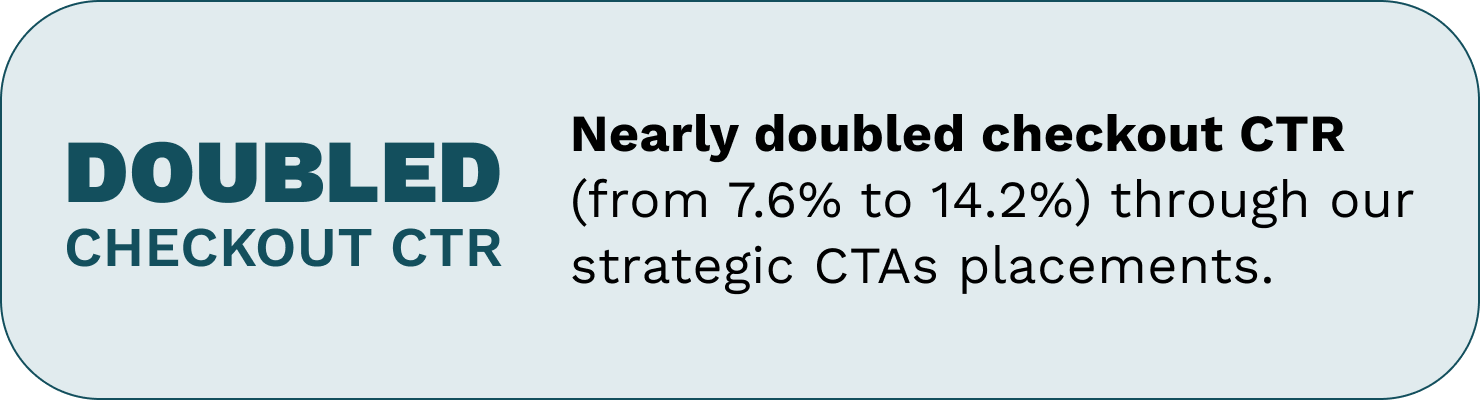
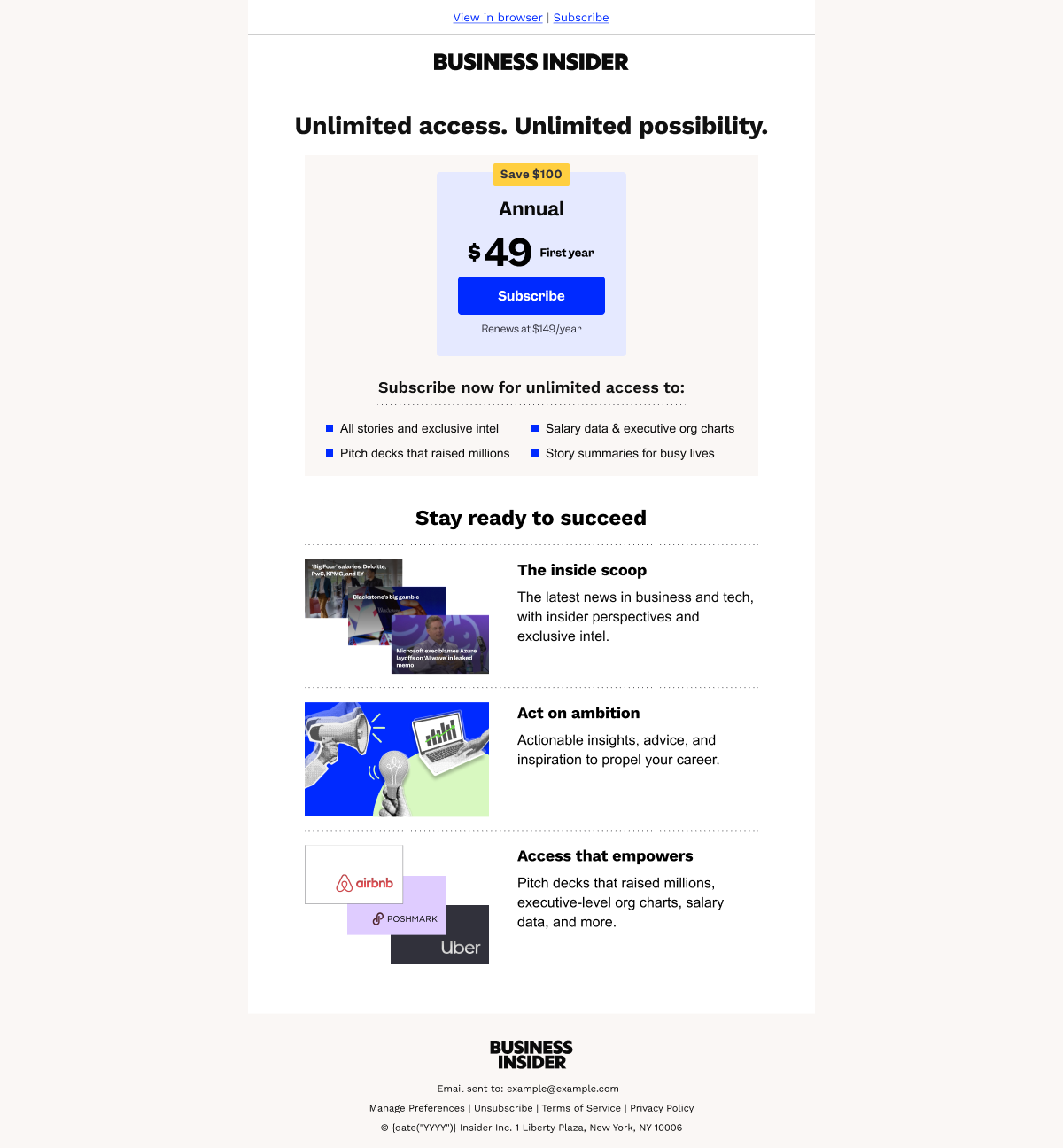
2. Automated lifecycle emails with an audience of over 1 million users.
Brief
Business Insider’s email library targets the whole user's lifecycle, with the goal of converting users to active, paying subscribers. Update Business Insider's emails (see slideshow) to reflect its new brand book and strategy across all company growth marketing templated emails.
Results and improvements


Leads nurture journey


Subscriber onboarding journey


3. App Rebrand
Brief
Update the strategy, user experience, and marketing designs across all channels that promote the Business Insider app. Translate the new branding to create an effective, informative app landing page for subscribers who are interested.

App landing page before rebrand and redesign. Desktop.
What improvements did we make?


Rebranded app landing page
Scroll through for desktop and mobile designs


1. User’s liked BI’s Breaking Blue color, how short the page was, the QR code and the store icons. Users liked how simple, straight forward, and how easy it was to download the app. Explore the possibility of the making app landing page design only “above the fold”.
“I like the, the engaging graphic at the top of the fold. And you have this very bright, engaging, happy blue color. You have the Business Insider brand and font, which is very recognizable.”
“It’s nice that it’s showing that you can get it, you know, from the Google Play Store or the Apple App Store.”
2. Users had questions surrounding being a “valued member”, “why BI over another media outlet”, and if there were any perks with downloading the app.
“The thing that you’re not selling me on here is like, well, what, why Business Insider over other news outlets. I wanna know what else you can do besides just kind of follow the topics that matter to you and discover trending stories. There’s gotta be other stuff”
“I wanna know what else you can do. There’s gotta be other stuff.”
3. Users felt messaging was clear and easy to understand but left wanting more.
“Although the shorter page kept users happy, it could be “a warning sign the app seems thin”.”
“One user felt like the 2 benefits “weren’t enough to entice people”. Explore updating copy to be more app benefit specific, to highlight “perks to downloading the app”.”
House ads, app store, emails, oh my!
Scroll through supporting designs


Note: Certain GIFs are not displayed here. However, based on our user tests, moving images perform much better due to a direct and clear value to our product.